The latest
The illustrator file is getting a bit ridiculous now:
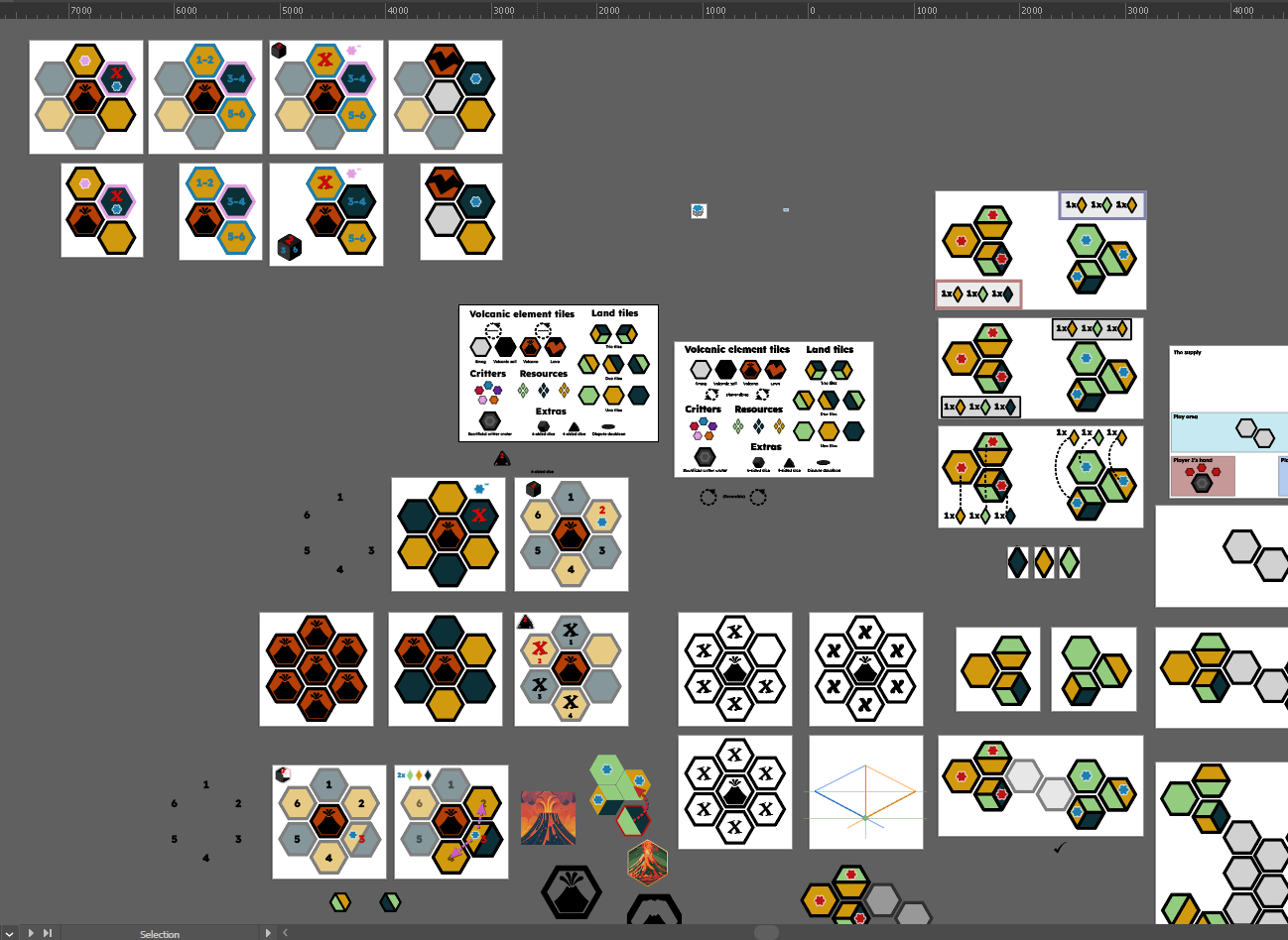
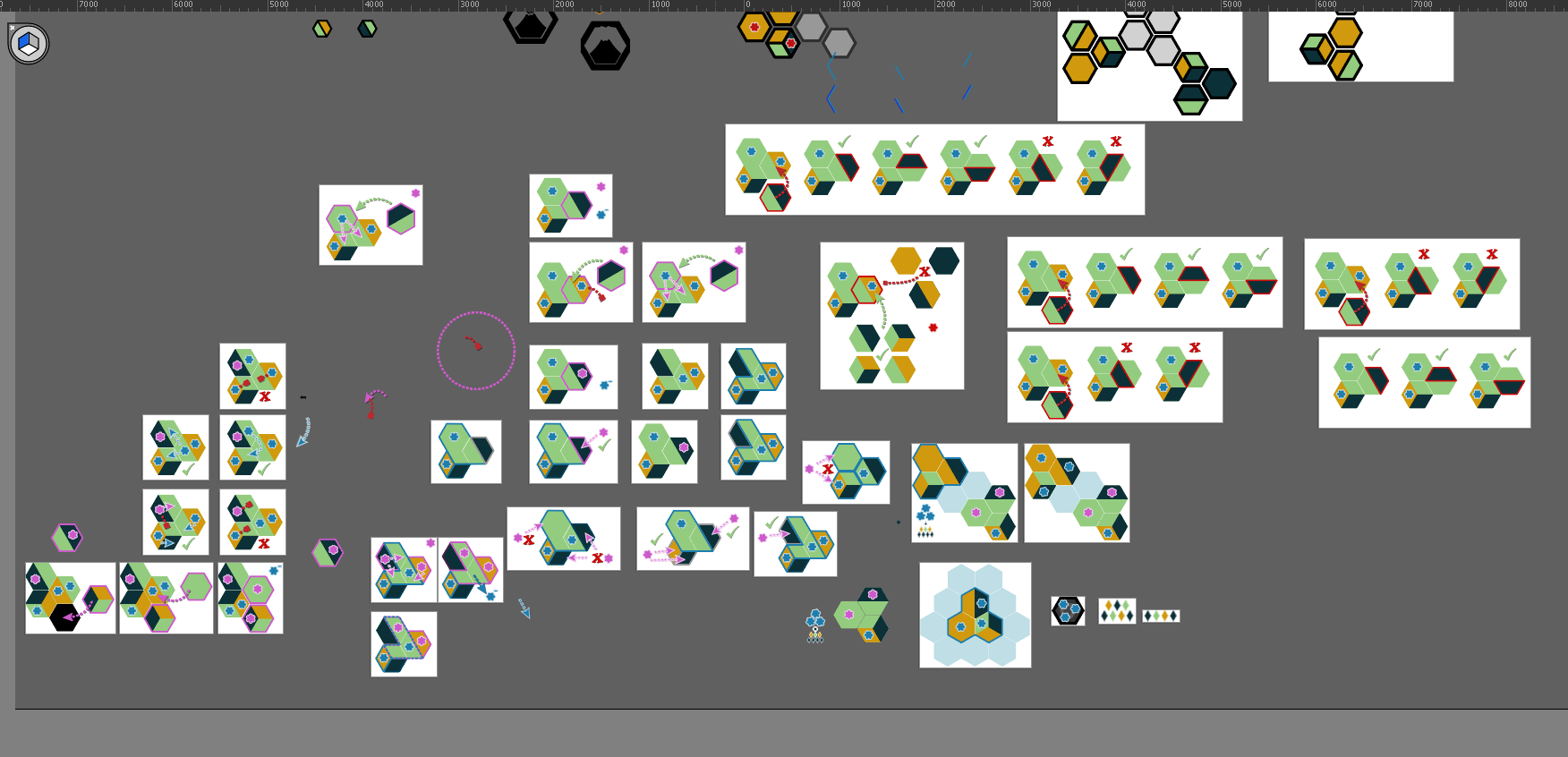
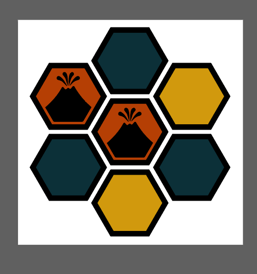
I realised I have two quite distinct styles rolling at the moment, the heavy border and the no/thin border option:
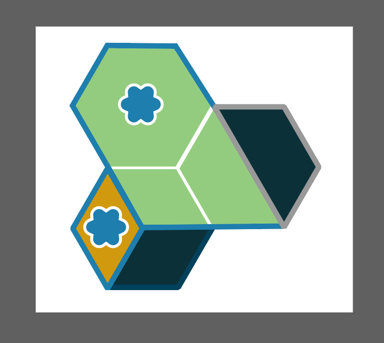
Still not entirely sure which I should go with. No border/thin border seems to make the most sense from trying not to veer too far away from what the game actually looks like.
The thick border is quite stylised, which I enjoy, but also it needed the big gap to be balanced. That’s where it falls apart as the connecting biomes don’t always read correctly.
I think I’ve basically answered my own question in the process of slowing down and thinking it out.
I do like a border around the areas that represent controlled borders, but getting the contrast for these right will be a little tricky and significantly more work unless I can think of a nifty javascript solution. But that wouldn’t work for a printed rulebook. Hmm.
Lava your comments here
Loading comments...